Uncategorized

Wrought iron without the weight. An affordable alternative to custom iron work.
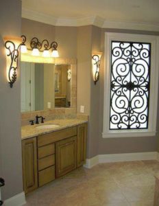
Faux wrought ironWrought iron work sure is pretty, isn’t it?

It looks beautiful in a home, whether on the walls or ceiling or even on the windows. Wrought iron can be decorative or practical. It can be a wall sconce that holds a light, be a decorative piece that adds stunning beauty to a ceiling or reinforce the security of your doors and windows while adding an elegant look.

Why don’t more people use these beautiful pieces in their homes? Because authentic wrought iron work is very heavy and difficult to install. It’s also made by hand and is very expensive.

Many people don’t know that an alternative is available. Tableaux Faux Iron, a company in Texas, makes custom faux wrought iron. It looks just like the real thing, but is much lighter and much more affordable than real wrought iron work.

Tableaux products come in many designs and finishes. Each piece is made to order and the designs can be customized by size and pattern. Choose a standard finish or submit a custom color.

  • Iron (no rust, light rust or full rust)
  • Antique Bronze
  • Aged Gold
  • Aged Silver
  • Buckingham Gold
  • Patina Bronze
  • White

This lighter version of wrought iron can be used in creative ways that are difficult to accomplish with the heavier authentic version. We can use them to subtly divide a room.  They can be installed as unique valances or as part of a window treatment.

Our designer, Theresa Guthals, recently designed a bathroom and used the Tableaux faux wrought iron on the ceiling. The room started out as an ordinary bathroom, but the wrought iron gives it a romantic, soft look. You wouldn’t expect that from a product made from something so solid, but Theresa knows how to use it to its best advantage.

She can add the same magic to your home. Contact us for a consultation and learn about new ways to bring texture and depth to your home.

Why a faux finish is better than wallpaper. A ghost story.

Faux Finish Colorado SpringsSome people dislike wallpaper, but how often does their dislike seep into the supernatural world?
A researcher of ghosts came across such an instance once. This person stayed overnight at an old hotel that was rumored to be haunted. He explored and searched the place well into the night. Despite climbing into attic spaces and venturing into untended halls where no one had stayed for years, he found nothing scarier than cobwebs.

Our intrepid researcher gave up and went to bed, disappointed. It was just an ordinary hotel. But wait! In the middle of the night he awoke with a start!

Nothing was visible in the darkness. All was still …

Except for the sounds of screaming and tearing down wallpaper in the next room!

The guest jumped up and turned on the light, annoyed. Who was in the next room? What kind of person has some sort of anti-wallpaper fit in the middle of the night in a hotel?

He called the front desk and they knocked on the door. No answer. The desk clerk opened the door and the screaming stopped.

The room was empty. And just like the rest of the hotel, the walls were neatly painted.

***

You might hate wallpaper as much as that ghost, but still want a pattern or an effect on your walls. Our interior designer, Theresa Guthals, can recommend a faux finish for your décor. She helps you select a color palette and finish, find an artist and manage the painting project.

The latest in faux finishes emulates metal, but doesn’t have metal in it. We even worked on a home recently to add a gold faux finish with a beaded application, for dimension. This kind of work can be painted on the walls or the ceiling, to highlight an architectural feature or add interest to the room.

Whether you’d like to talk about a faux finish or prefer wallpaper, we can help you make the most of your walls.

Just check to make sure the ghosts don’t have a preference before we get started.

Art on the Wall. How to Have a Mural Painted in Your Home.

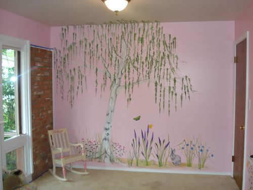
Artwork by Erin Hill

Artwork by Erin Hill

Are you staring at a big blank wall?

Maybe it’s a big wall in a big house or maybe it’s a long wall in an office. Wherever it is, it’s an opportunity for something beautiful.

You could adorn it with art, especially if you like a certain type of artwork or already have a collection.

Or you could have a mural painted!

A mural can add drama or make a statement in a room. You can have one that calms you or gets you fired up. A mural can set the stage for the customer experience at your business. An artist can personalize the space for you in the best way possible.

An artist is important, but don’t forget the interior designer. The designer is like the conductor and the artist is like a musician playing a solo. Without the conductor, the soloist might start at the wrong time or play something that doesn’t fit with the rest of the musical piece. Similarly, the artist produces beautiful work, but the interior designer makes sure the mural works in the room and the space is arranged to bring it to its best advantage.

The interior designer can tell you in advance whether a mural is the best choice for the space. She works with you to select the color palette based on the other objects in the room and helps you arrange the furniture to reinforce the message you’re trying to send.

Our designer, Theresa Guthals, is currently working on a mural for a commercial space. This particular mural for a treatment center has an urban theme and is designed to appeal to people aged 18 – 30. Theresa takes care of all the details, such as contacting local mural painters and arranging the schedule. She works with the client to select an artist, to approve the sketches and to choose the colors.

How can you have a mural painted in your home? You contact us and Theresa will come out to your home to look at the space. She will evaluate the wall and make recommendations about whether a mural would work well. If it does, she will contact the best artists for your project and help you choose one.

Theresa works with the you to come up with a design and colors. The artist will sketch a design and once you approve, the project begins. Theresa coordinates any necessary contractors and she will make recommendations about arranging the room when the mural is complete.

The whole process is relatively simple, once you’ve contacted us. Theresa works closely with clients to bring your ideas into reality and turn an ordinary wall of your home or business into the message you want to convey.

Contact us today and make the most of that blank wall!

Choosing a paint color without climbing the walls

Choosing a paint color seems like such a high-stakes game. Paint is an inexpensive way to update a room, but if you have to correct a mistake by painting a second time then the costs start to add up.

Paint updates the exterior of a home too. Here in Colorado Springs, you may own a home in one of our many new developments that are governed by Homeowners Associations that need to approve any changes to the color. This can be a challenge as well.

A skilled designer can help you choose the right color the first time. Our designer, Theresa Guthals, walks clients through a process to determine what colors would be appropriate for their home. Choosing the best color requires knowledge of how pallets of colors work together and what textures are appropriate for different uses. A designer also needs to understand how light and shadow will affect the way the color looks.

Theresa has been part of hundreds of paint consults and has kept track of what works and what doesn’t. She knows what colors and textures will work with your project without the trial and error homeowners usually go through.

Theresa works with clients to choose colors for the exterior of their homes too. She recently worked with a local couple in an HOA-governed development who had an idea of what they wanted to do with the outside of their home, but were concerned that the Architectural Committee might not approve.

Theresa suggested that they take a walk around the neighborhood to see what kinds of colors the Committee had already approved. They took her advice and even went so far as to knock on a door of a home with a color they liked. The homeowner answered the door, showed them the paint cans and they became friends.

Save yourself time, worry and money by contacting us to help choose the right colors for your home. We even know the best painters in town for everything from exterior paint to faux finishing and murals.

And who knows? You might even make some new friends!

Why is it pretty? How interior designers use geometry in your home.

pikes-peak-interiors-2-29-12Did you wonder in high school when anyone ever uses geometry in real life? Few people calculate the mathematics of their furniture arrangements, but geometry is actually what makes the difference between an attractive arrangement that makes sense to the eye and one that doesn’t.

Furniture arrangement often mimics shapes and patterns seen in nature. Symmetry looks balanced to the human eye. For example, the arrangement of petals around the center of a daisy is symmetrical. We also tend to prefer faces that have evenly spaced features.

Interior designers use these same principles when arranging a room.

Symmetry/Asymmetry: Symmetry is an exact correspondence of things on either side of a focal point and asymmetry takes one or more of those objects out of the balance. This adds interest to a room.

Geometric shapes: We use the arrangement of shapes to add to the symmetry or asymmetry of the arrangement. Shapes are particularly important in odd shaped rooms.

Our designer, Theresa, did a consultation in a dome shaped house with curved walls once. Curved walls have less wall space than straight walls and the furniture doesn’t line up squarely. Theresa’s familiarity with the use of geometry in design helped her see where the furniture would look best.

Rule of Thirds: Have you heard of the rule of thirds? It’s often used in photography. A frame is divided into nine equal parts and items of interest are placed on the lines and points of intersection. Of course you don’t see the lines in the finished picture or in a well-arranged room, but since the eye naturally goes to these points, the room looks balanced.

This is not to say that interior designers don’t break and bend the rules when arranging a room. They may use a combination of symmetry, asymmetry and shapes, but the mathematics of the arrangement work together.

Aren’t you impressed? Your interior designer is a kind of mathematician. Geometry and other types of mathematics make things pretty, even if we didn’t pay attention in school.

error: Content is protected
25% Off - Contact Us!

25% Off Regular Retail on Designer Fabrics for Custom Drapery!

Contact Us Today for a Consultation!

[contact-form-7 id="7" title="Contact form 1"]
25% off regular retail on designer fabrics for custom drapery!